I’ve had my shingle out for years doing freelance graphic design work, but a recent personal brand/identity project spurs me toward making a more formal announcement.
So yeah. I’ve been doing print layout and design for about half my life, longer if you count my teen years when I learned calligraphy (the start of my design career, really).
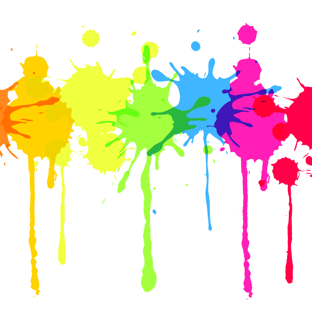
If you know me, the yellow spatter makes PERFECT SENSE. Yeah?
Have I ever told you the story behind the nickname “RameyLady”? It’s not really that much of a story. A teenager who wasn’t one of my students but who became a dear, sweet friend after I met her (thanks to my students, with whom she was friends) dubbed me “RameyLady” in contrast to “The Mister.” The honorific stuck and picked up wider usage among the kids we were working with at the time. I like it.
And below are a few work samples, mostly poster design or associated web graphics. You’ll notice that I have done a lot of show posters for The Fire Tonight. It’s a fun creative outlet. But I thoroughly enjoy page layout and design for books and magazines.
Early poster for The Fire Tonight, when they were still known as the Collin Derrick Band. Photos by Albert Spear
I think screen shots of work in progress are pretty interesting. Also, I always end up extending a print design into other media like Instagram or Facebook photos, profile shots, Twitter graphics, or sometimes additional print forms (like postcards or invites).
I’m most proud of my formal print layout work for the magazine at the college where I work. I may be the only person in the office who genuinely likes the work of a bi-annual magazine. I enjoy the challenge.
Early tour poster. I barely knew what I was doing in Adobe….
Baptism invite for a friend. He provided the photo.
Something I did for a student interdisciplinary unit when we were teaching at NCS.
I took this shot. I rarely do my own photography for projects, but I’m hella proud of this image. And this play. And the actors. And the entire production. (2007)
More Hamlet stuff. The show itself was set in 11th C Denmark, but our early posters were all in street clothes.
I didn’t do the cherry blossom illustration, but the layout is mine. Another poster for an NCS production.
I like to play with minimal designs, shapes, text.
The back of a cast t-shirt. The show had a Japanese theme in costumes and production design.
Some relatively early page layout work for me – I used to do the bulk of the yearbook design for NCS. For this comic book adventure theme, I shot photos of students acting out the storyboard scenes, then ran them through a mix of Photoshop filters to get a “drawn” effect. Labor intensive, but probably my favorite yearbook.
Some friends started a touring company. After we did a more traditional brochure, we realized they needed a PDF for delivery via email, so I tore it apart, modernized everything including the logo, and reoriented the brochure for on-screen reading.
For a friend’s gig in Greenwood.
Show poster for current NCS production, part of a larger fundraising event.
I can’t explain why this works, but I’m pretty sure it does. Vintage vector.
Maybe the creepiest thing I’ve ever used in a design? But also the coolest? Vintage vector from a medical text, I assume.
This one never made it into the rotation. I was playing around with the color combo.
My fav series for these guys. They did a 4-show tour last summer, so I hooked them up with a series of colorful posters inspired by 1950s sci-fi book covers and artwork.
A detail of one of 4 posters for a summer tour. Blasting off into rock! 🙂
Once in a while I have time to just play around with design, like this t-shirt I did for the Woot! shirt derby,


Got a comment?